- Aion Classic
- Alone in the Dark
- Baldur's Gate 3
- Cyberpunk 2077
- Dead by Daylight
- Death's Door
- Dice Legacy
- Dragon Age: The Veilguard
- Elden Ring
- Elden Ring: Nightreign
- Fallout 4
- Final Fantasy X/X-2
- Going Medieval
- Gotham Knights
- Hearts of Iron IV
- Hogwarts Legacy
- ICARUS
- Palworld
- Rust
- Sifu
- Sons of the Forest
- Starfield
- Stranger of Paradise: Final Fantasy Origin
- Stray
- The Callisto Protocol
- The Elder Scrolls Online
- The Elder Scrolls V: Skyrim
- The Forgotten City
- The Outer Worlds
- The Witcher 3: Wild Hunt
- Valheim
- World of Warcraft
- World of Warcraft: The Burning Crusade
- World of Warcraft: Wrath of the Lich King
- WoW Classic
Welcome to EIP Gaming!
EIP Gaming is a site for gamers looking for gaming guides and gaming news! We cover a variety of games including World of Warcraft, Cyberpunk 2077, Fallout 4, HOI4, Final Fantasy X/X-2, Skyrim, Valheim, The Outer Worlds, Dead by Daylight, Death's Door, The Forgotten City, ICARUS, Elden Ring, Sifu, Stranger of Paradise: FFO, Hogwarts Legacy, Starfield, Rust, Stray, Gotham Knights, Sons of the Forest, Baldur's Gate 3, and other AAA and indie game titles.
Our detailed guides will help you enhance your gaming experience, improve your gameplay, and help you gain efficiency!
Follow On Us
Recent Updates


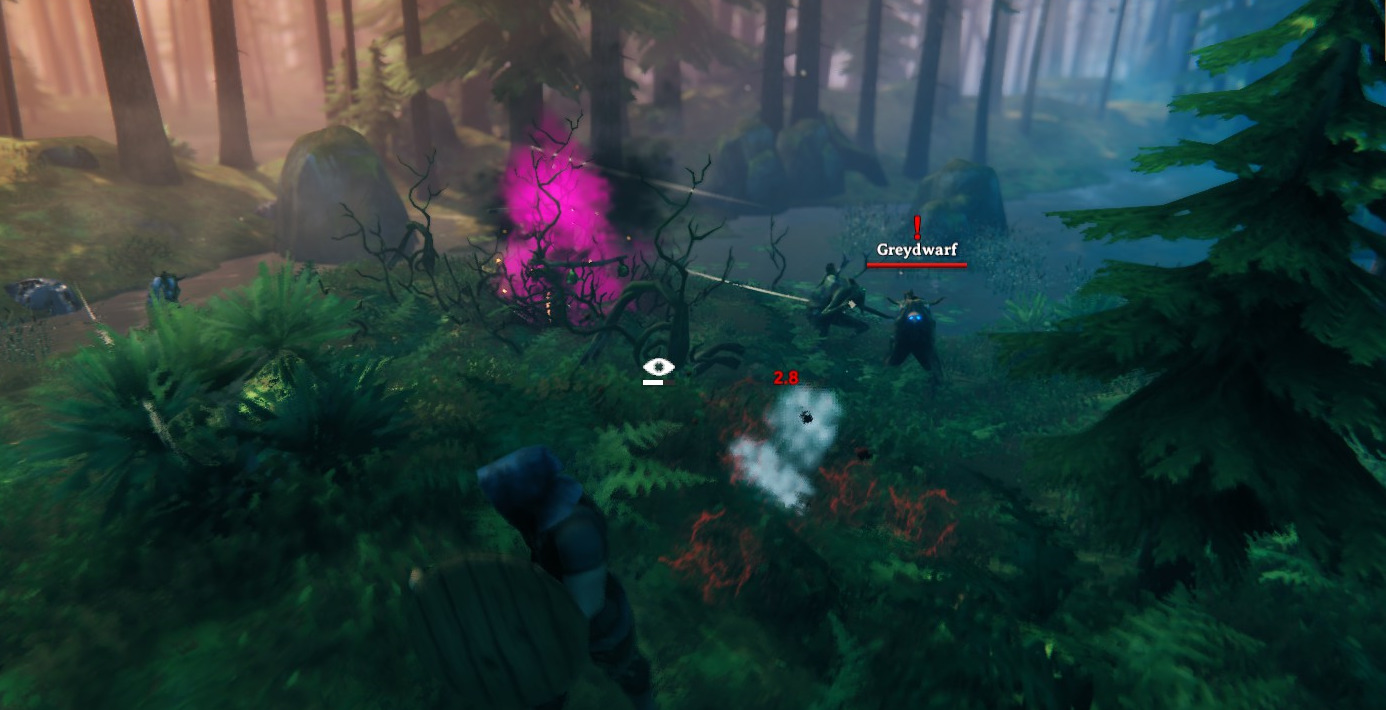
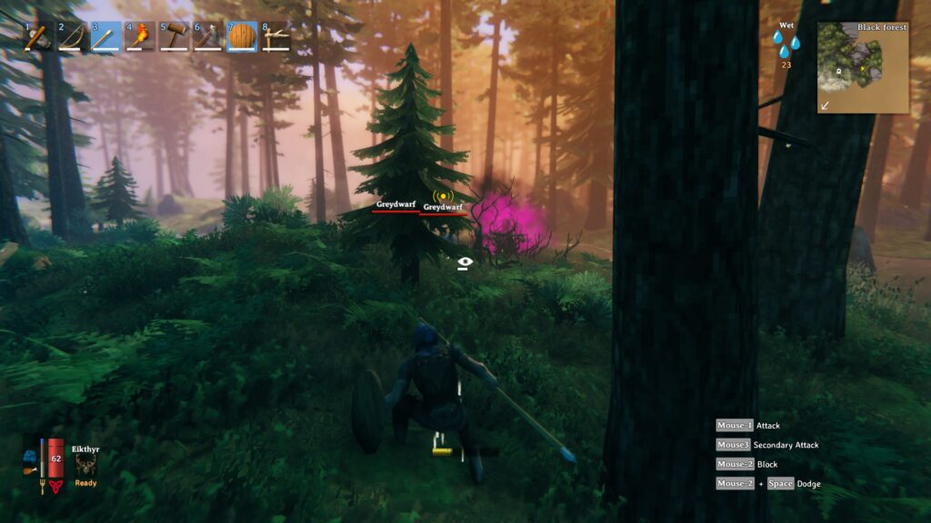
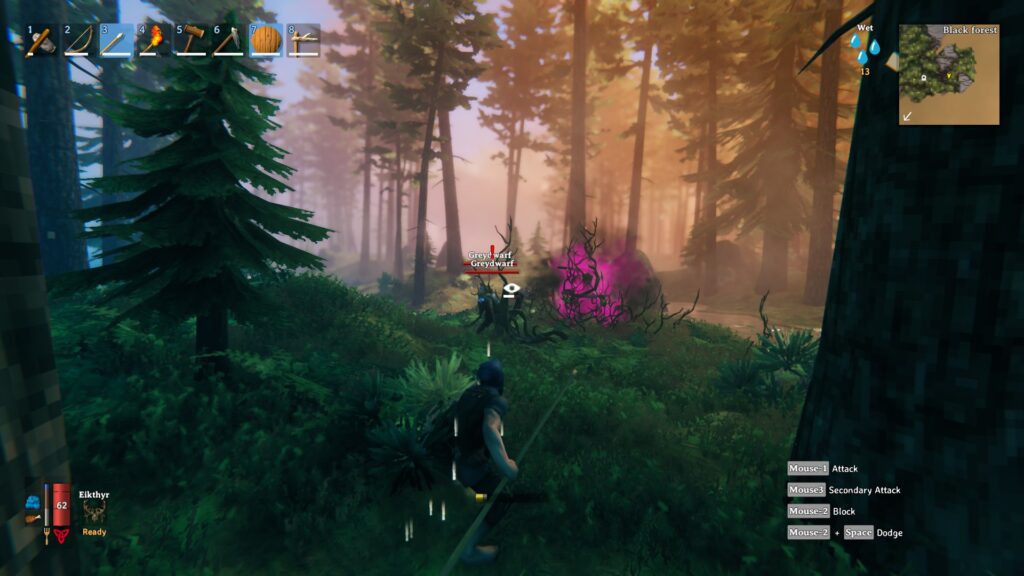
It’s horrible. They’ve built such a visually pleasing and immersive world to clutter it with half a dozen awareness icons when mobs are on the screen. I hope they remove it or make it optional. There’s really no need for it.
I agree, it’s definitely jarring. Useful, but definitely too big and certainly something that could be made optional. Although it makes combat more dangerous, a temporary solution is to use control+f3 to completely remove the HUD.