- Aion Classic
- Alone in the Dark
- Baldur's Gate 3
- Cyberpunk 2077
- Dead by Daylight
- Death's Door
- Dice Legacy
- Dragon Age: The Veilguard
- Elden Ring
- Elden Ring: Nightreign
- Fallout 4
- Final Fantasy X/X-2
- Going Medieval
- Gotham Knights
- Hearts of Iron IV
- Hogwarts Legacy
- ICARUS
- Palworld
- Rust
- Sifu
- Sons of the Forest
- Starfield
- Stranger of Paradise: Final Fantasy Origin
- Stray
- The Callisto Protocol
- The Elder Scrolls Online
- The Elder Scrolls V: Skyrim
- The Forgotten City
- The Outer Worlds
- The Witcher 3: Wild Hunt
- Valheim
- World of Warcraft
- World of Warcraft: The Burning Crusade
- World of Warcraft: Wrath of the Lich King
- WoW Classic
Welcome to EIP Gaming!
EIP Gaming is a site for gamers looking for gaming guides and gaming news! We cover a variety of games including World of Warcraft, Cyberpunk 2077, Fallout 4, HOI4, Final Fantasy X/X-2, Skyrim, Valheim, The Outer Worlds, Dead by Daylight, Death's Door, The Forgotten City, ICARUS, Elden Ring, Sifu, Stranger of Paradise: FFO, Hogwarts Legacy, Starfield, Rust, Stray, Gotham Knights, Sons of the Forest, Baldur's Gate 3, and other AAA and indie game titles.
Our detailed guides will help you enhance your gaming experience, improve your gameplay, and help you gain efficiency!
Follow On Us
Recent Updates


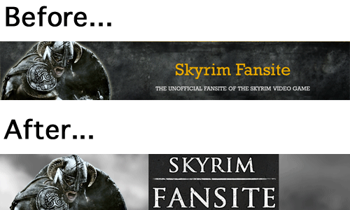
Skyrim Fansite has never looked better. Nice job 🙂
Thanks Seelix. Glad you like it.
I always liked the old design but I admit that I like this one even better. Its easier to read and the graphics are bigger. I also like the new wallpaper site. More wallpapers please!
Hi Synthia,
Yes, the old design really was hard on the eyes when reading. I’m really pleased with this new theme — bigger, darker fonts on a light background. The prior theme was a freebie we modified, and it definitely had it’s limitations. We purchased the new theme, and I’m happy with the result. Money very well spent.
Thanks for your positive comments on the new wallpaper section, and stay tuned — my hope is that we become the largest repository of Skyrim wallpaper on the internet. It’ll take time, but new wallpapers will be uploaded weekly. Make sure to vote for your favorites!
Nice site bro! Me like.